Fannin Counseling
& Art Therapy
BRANDING / DESIGN / MOTION Fannin needed a branding overhaul that conveyed its core traits, personality, and enthusiasm for helping others.
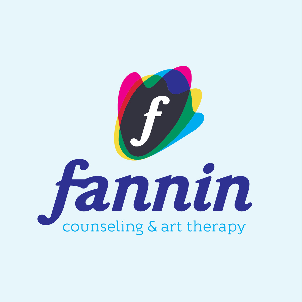
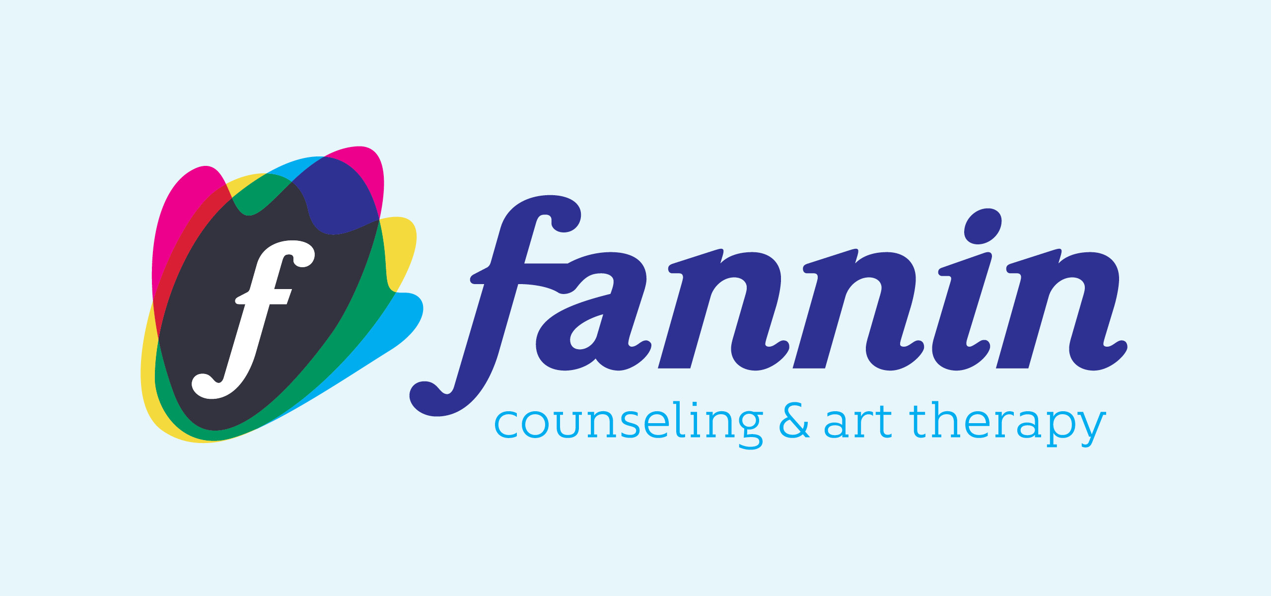
The icon and full logo needed to feel welcoming, friendly, and approachable. The bright colors, organic shapes, and rounded letters all help create this feeling. The letter f was also included in the icon so it could be recognized as a standalone mark.

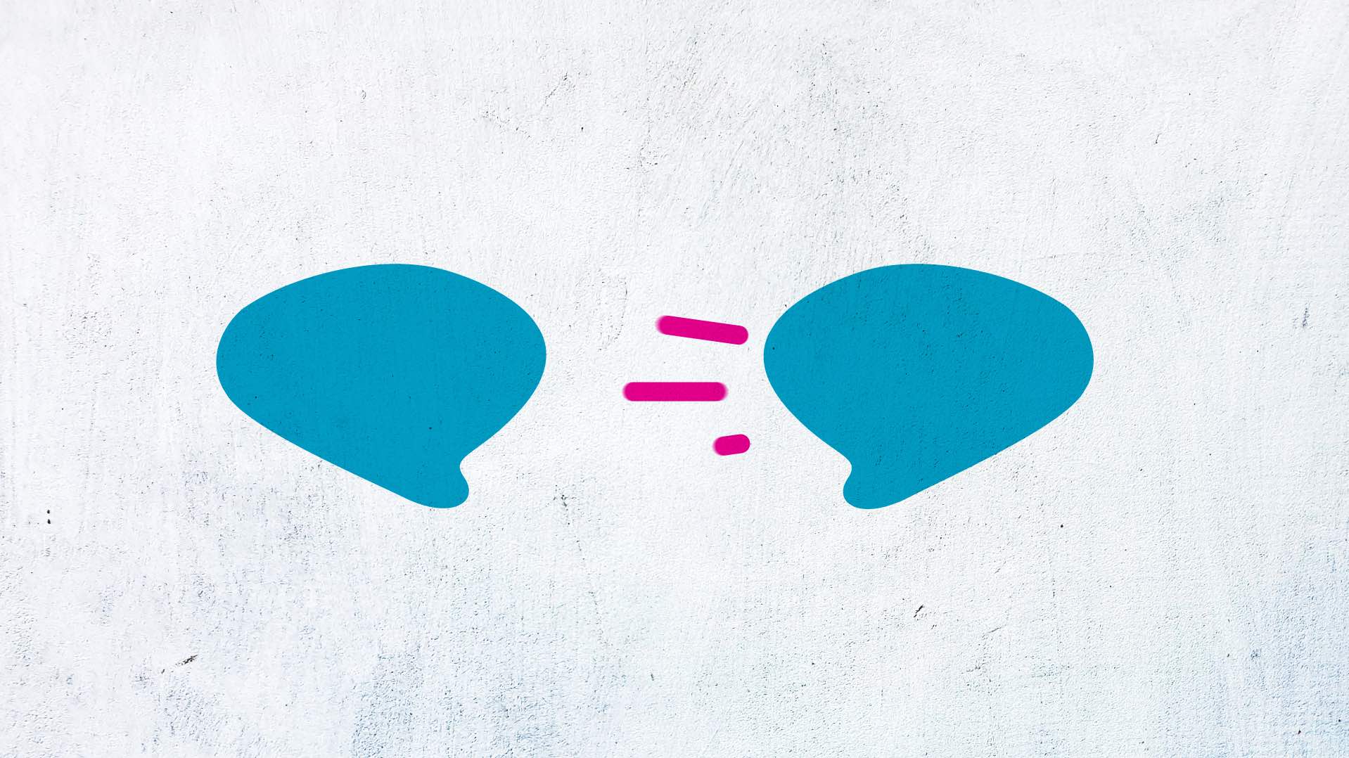
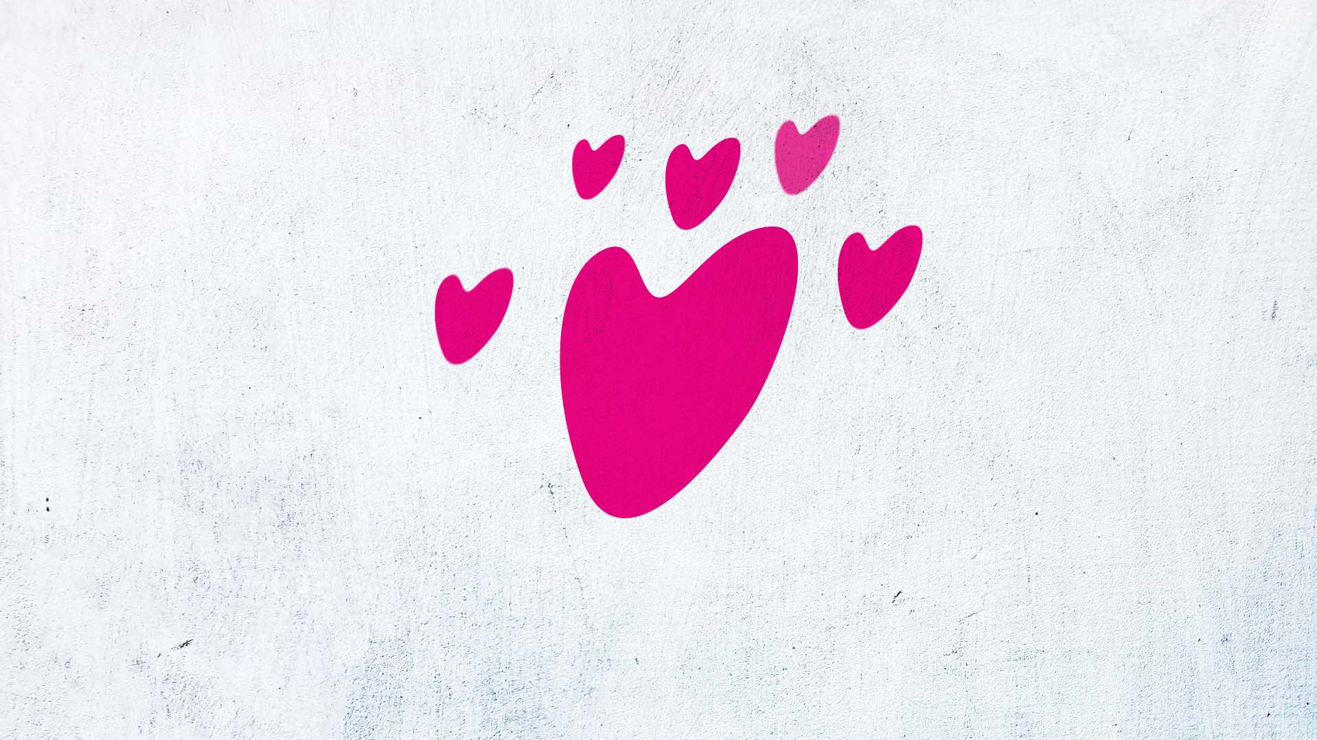
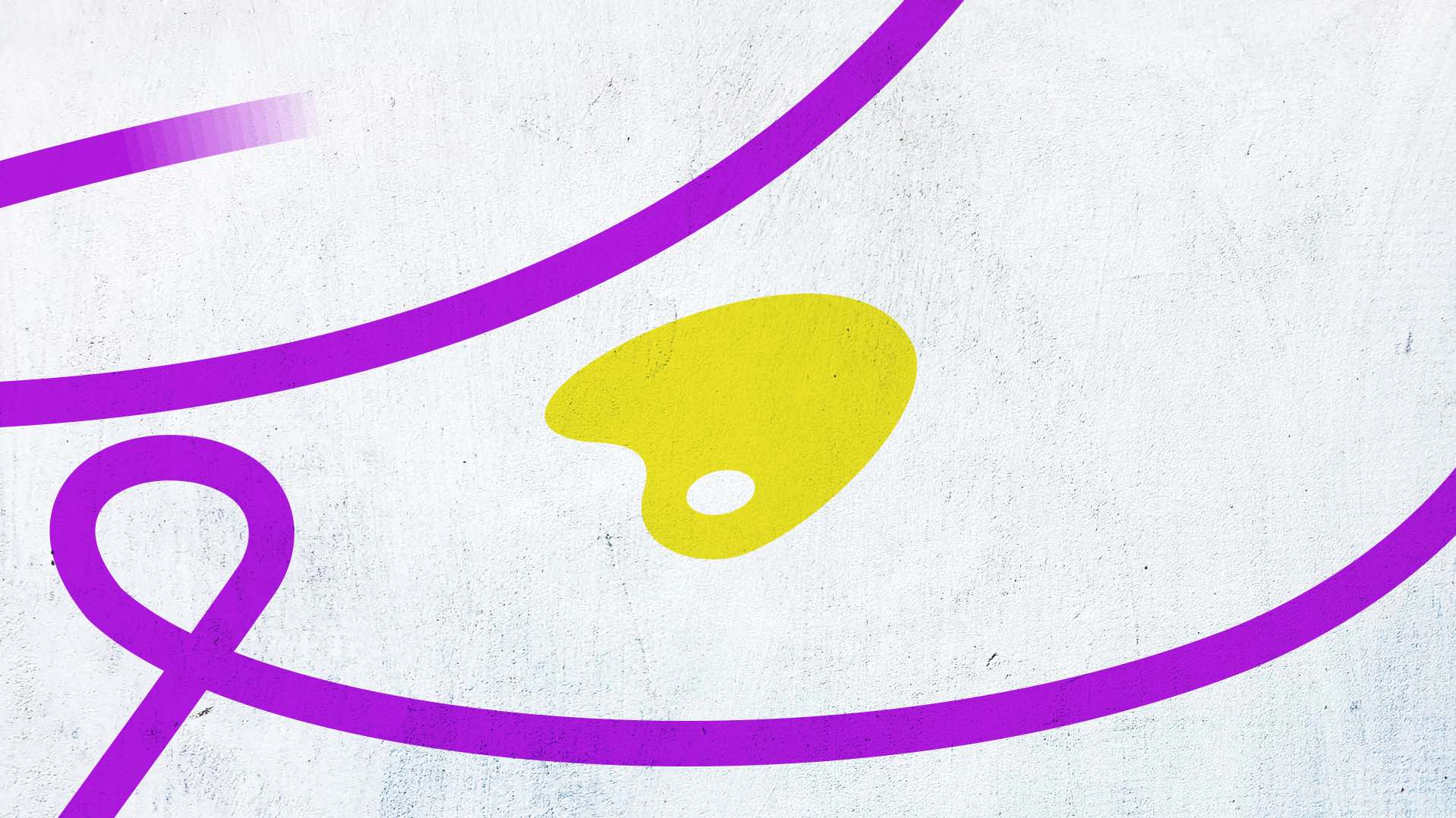
Bright, primary colors were chosen for their connection to art. They provide energy and are engaging. The overlapping shapes within the Fannin icon are three distinct shapes - heart, art palette, and speech bubble. These are at the core functioning of Fannin. Fannin connects with people, allowing them to share. People create to express themselves and their emotions. This allows them to safely and comfortably open up and communicate.


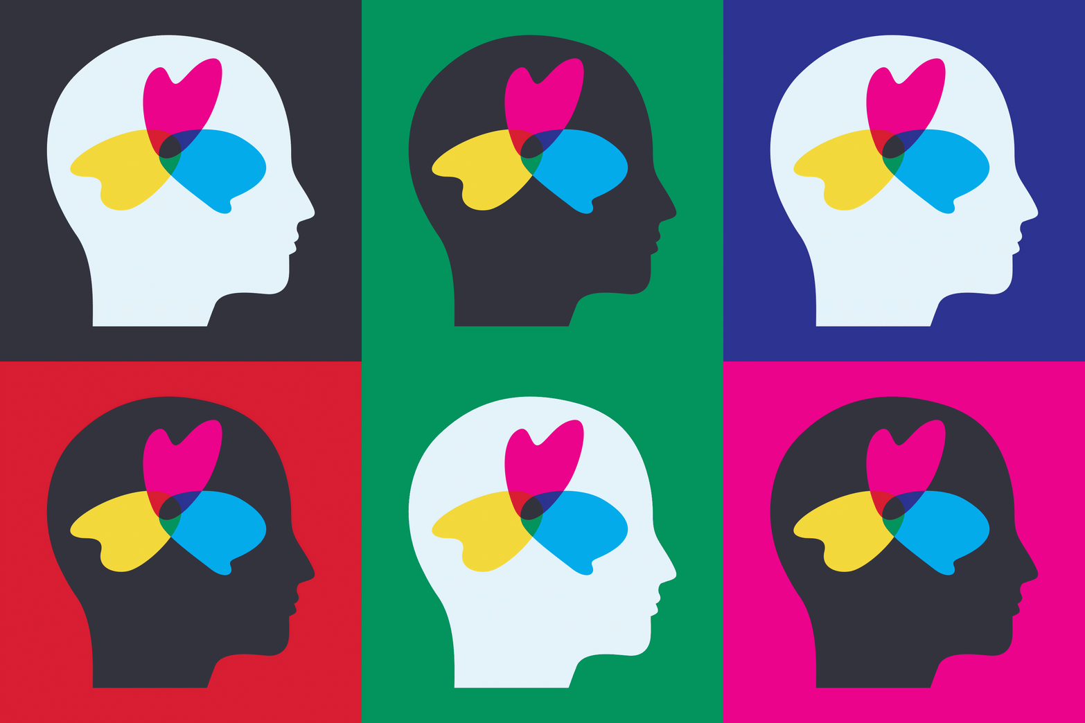

The shapes within the Fannin icon are also used as their own standalone mark, and within other graphics, such as the head silhouette.
The f in Fannin is representative of them reaching out and connecting with people they work with.
The f in Fannin is representative of them reaching out and connecting with people they work with.
With counseling sometimes having a stereotype around it, Fannin wanted people to draw their own conclusions upon entering their space. The pencil and pencil bag were a personal way to add some humor.

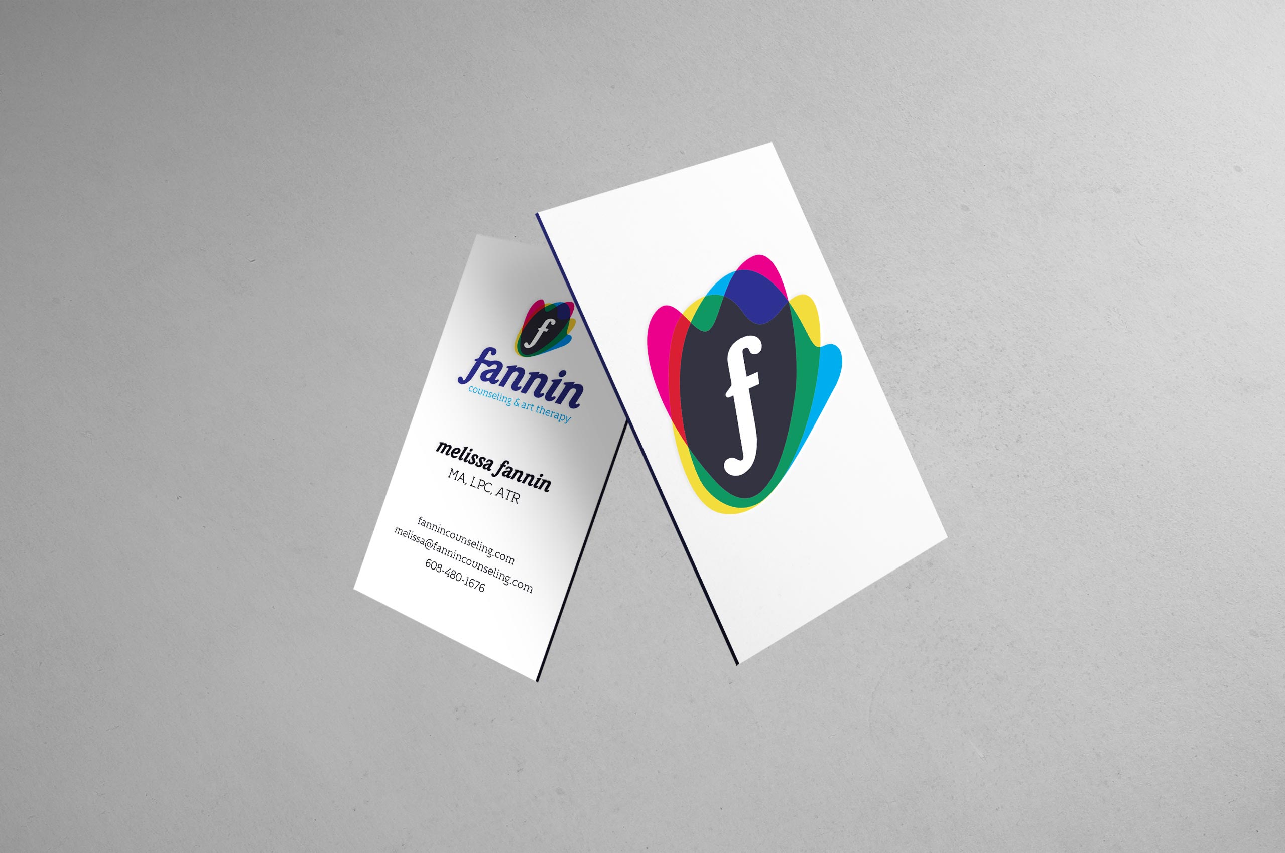
Their logo was animated, bringing life to the shapes within the logo.

All content ©️ 2024 Cody Bartz