
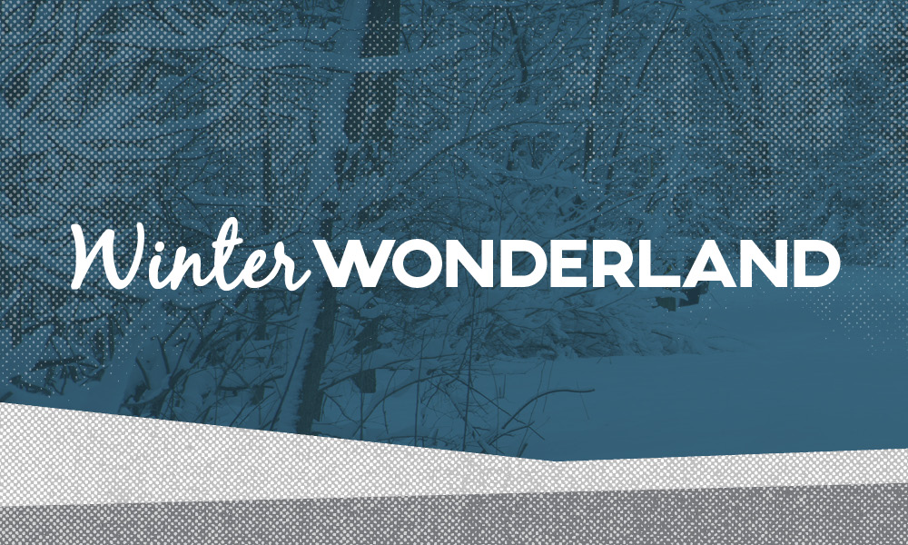
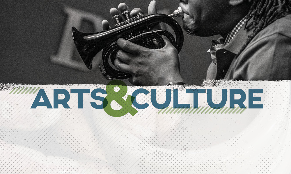
Explore La Crosse Visitor Guide 2020
DESIGN / ART DIRECTIONExplore La Crosse called back for a second year to work on their annual visitor guide. We kept what was working the previous year - many photos, bold colors, textures, and movement. This year we brought in new textures, linework, and alternate colors. Their brand colors were used, but also expaned upon, finding hues in the same range that were harmonious to the imagery. Feature photos were planned, scouted, and art directed.


Textures and shadows were used to create depth and dimension that appeared tangible.


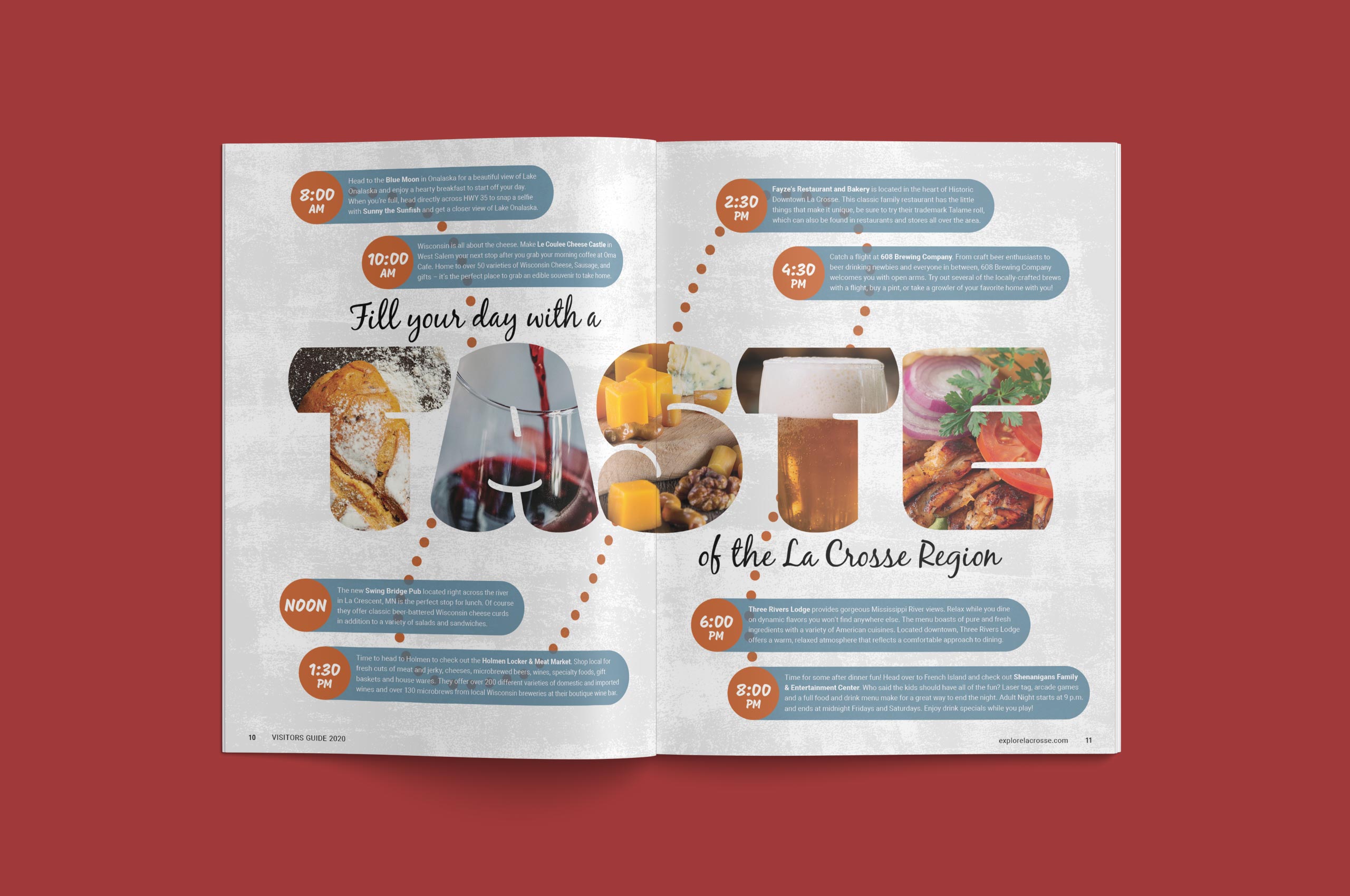


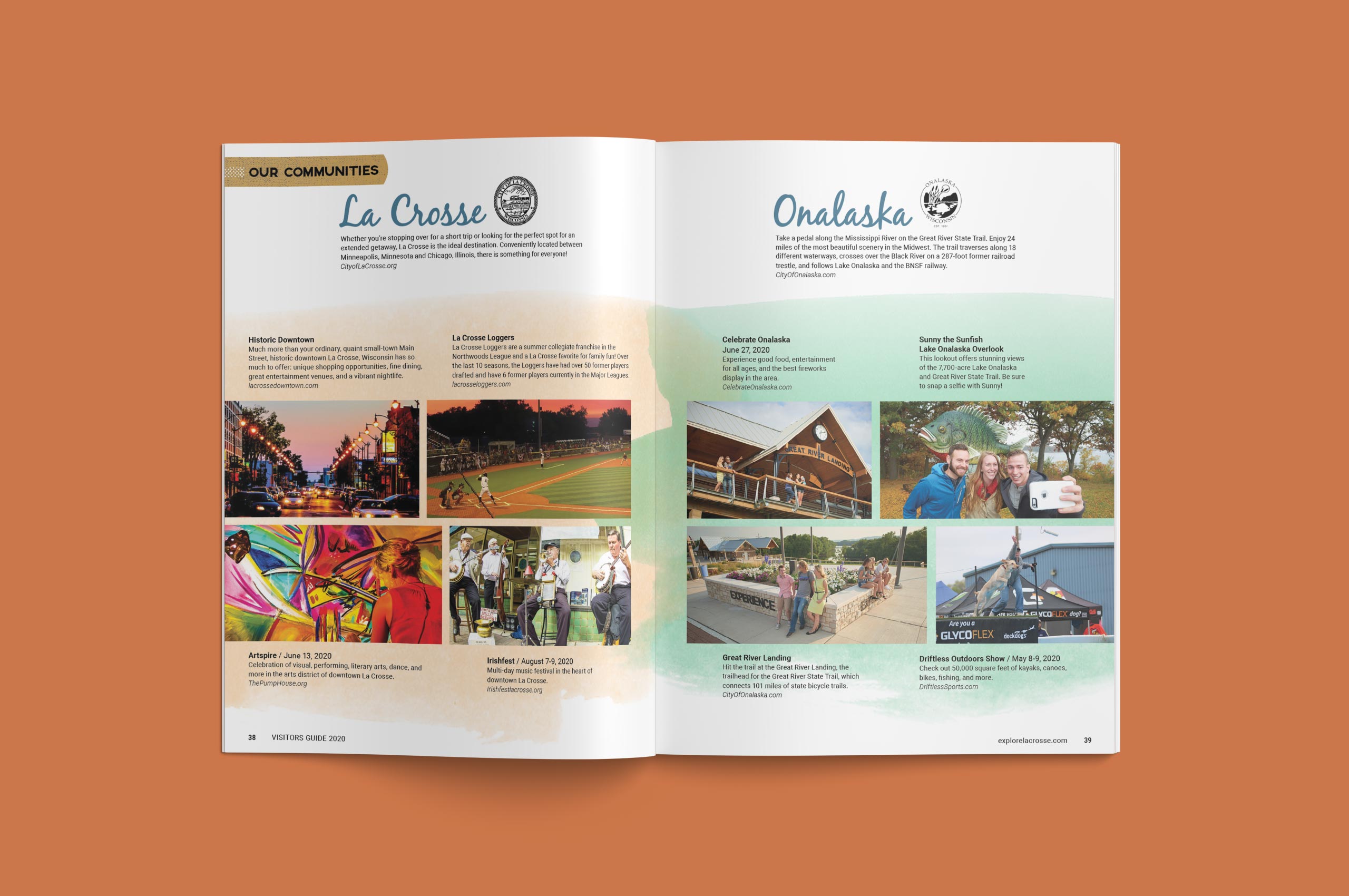
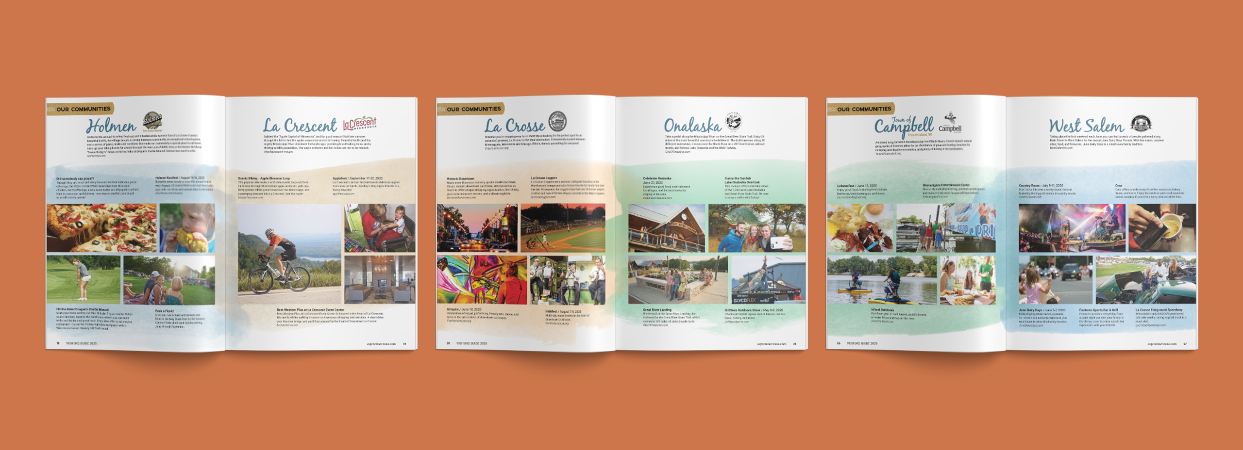
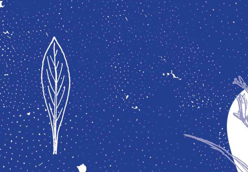
La Crosse, Wisconsin lies within the Driftless region, which was untouched by the last glacier that came through the midwest. It is defined by numerous tree covered bluffs and the Mississippi River. These six communities make up the La Crosse region. Put them together, and their background colors are symbolic of the transition of the landscape, from the river (blue) to the sandy banks (tan) to the bluffs (green) and lastly to the sky (back to blue).

The image in the background is a persons hands while at the pottery wheel. This subdued background, images layered on top of each other, lines, shapes, and overlapping text and textures create an artistic canvas to interact with.


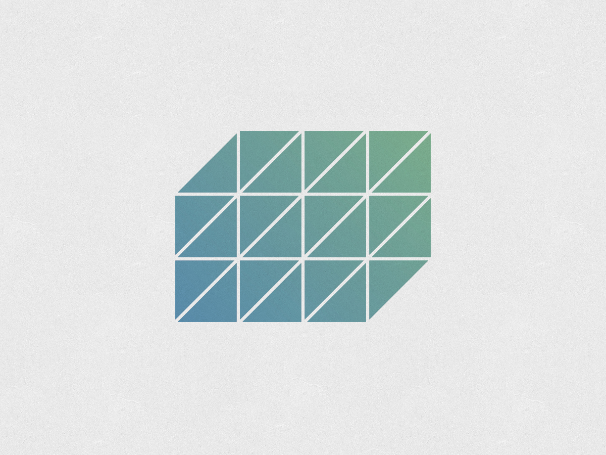
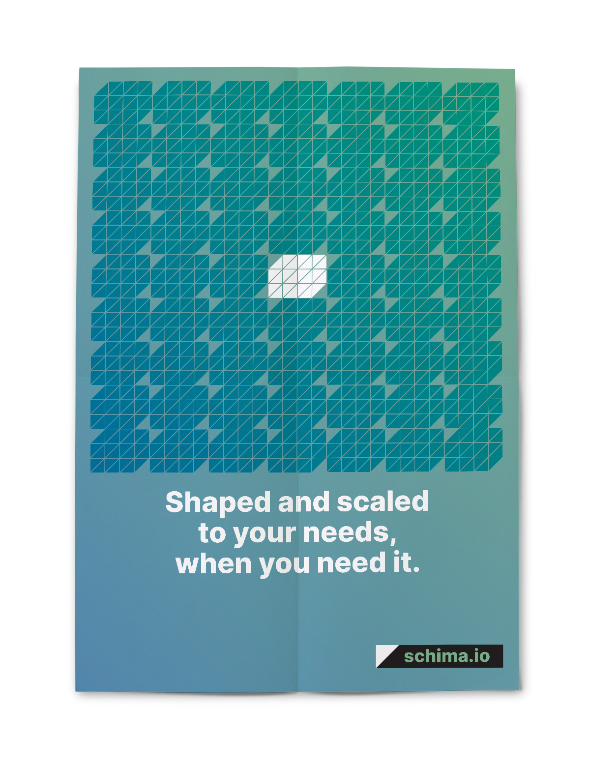
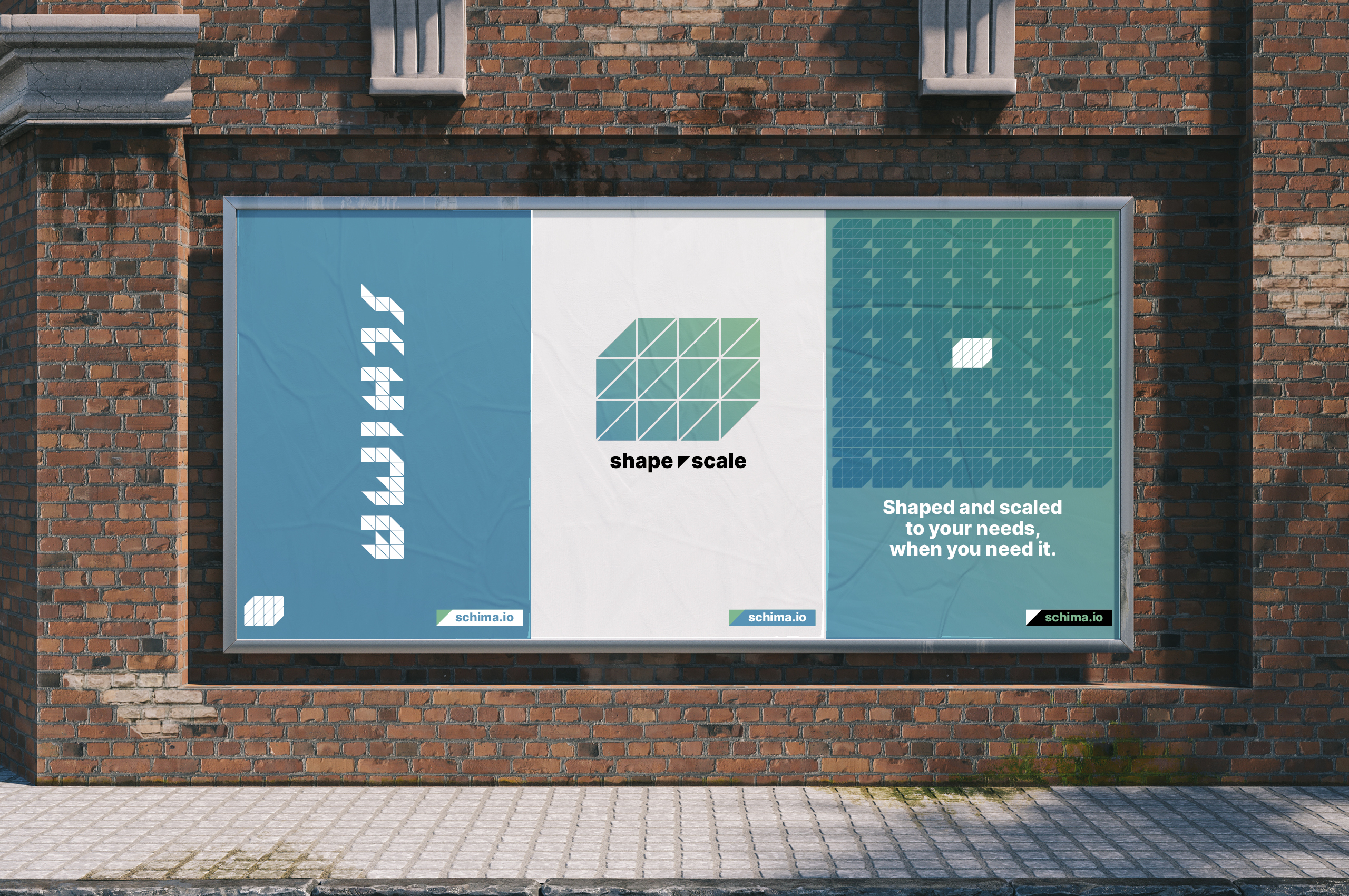
Schima
BRANDING / DESIGN / MOTIONSchima is a development and digital strategy studio. They are a group of individuals that partner on projects, redefining their shape and scaling up or down as their clients need.


Organic Valley
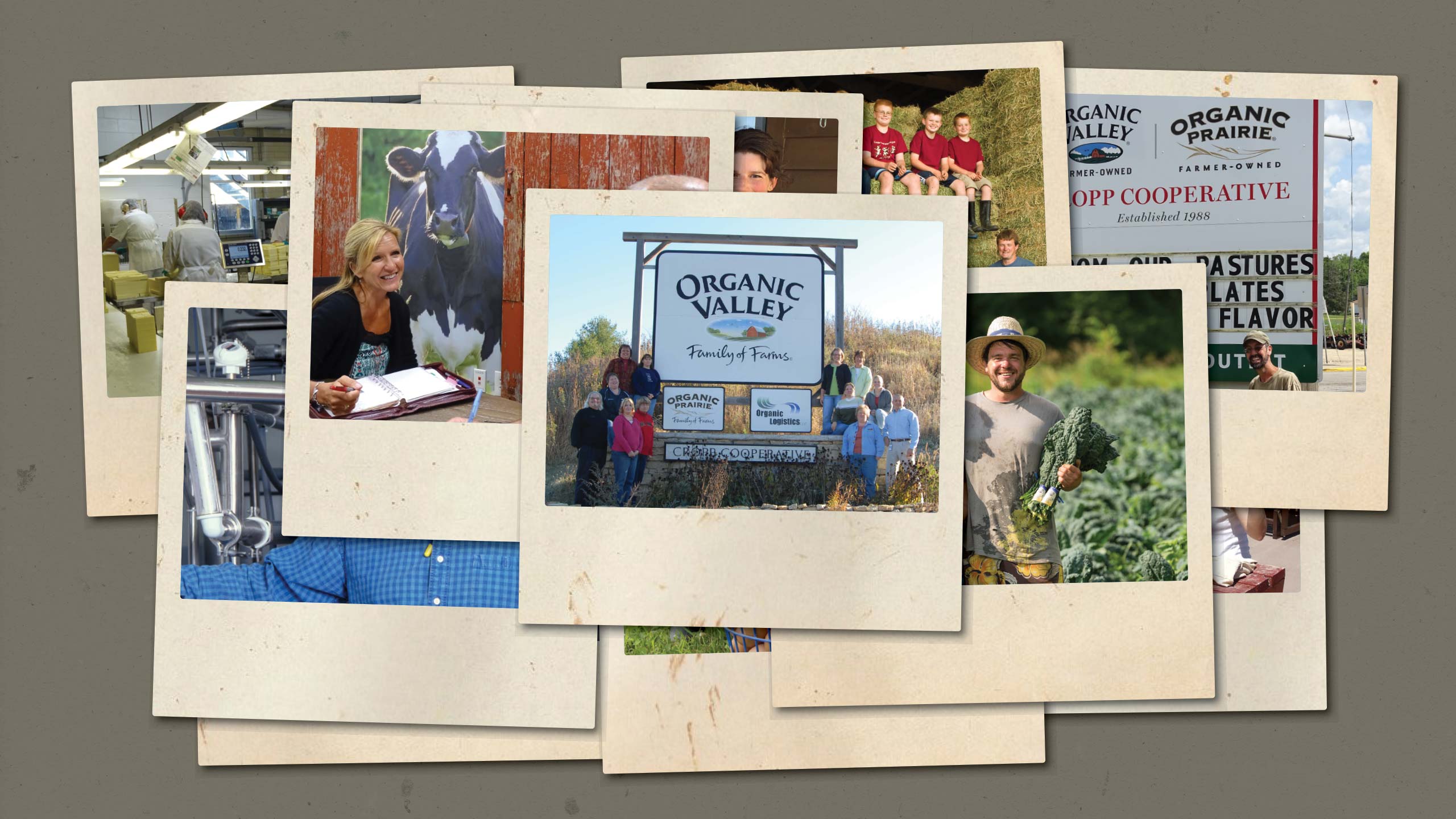
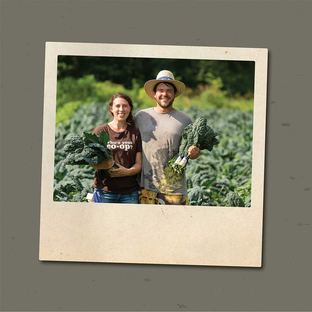
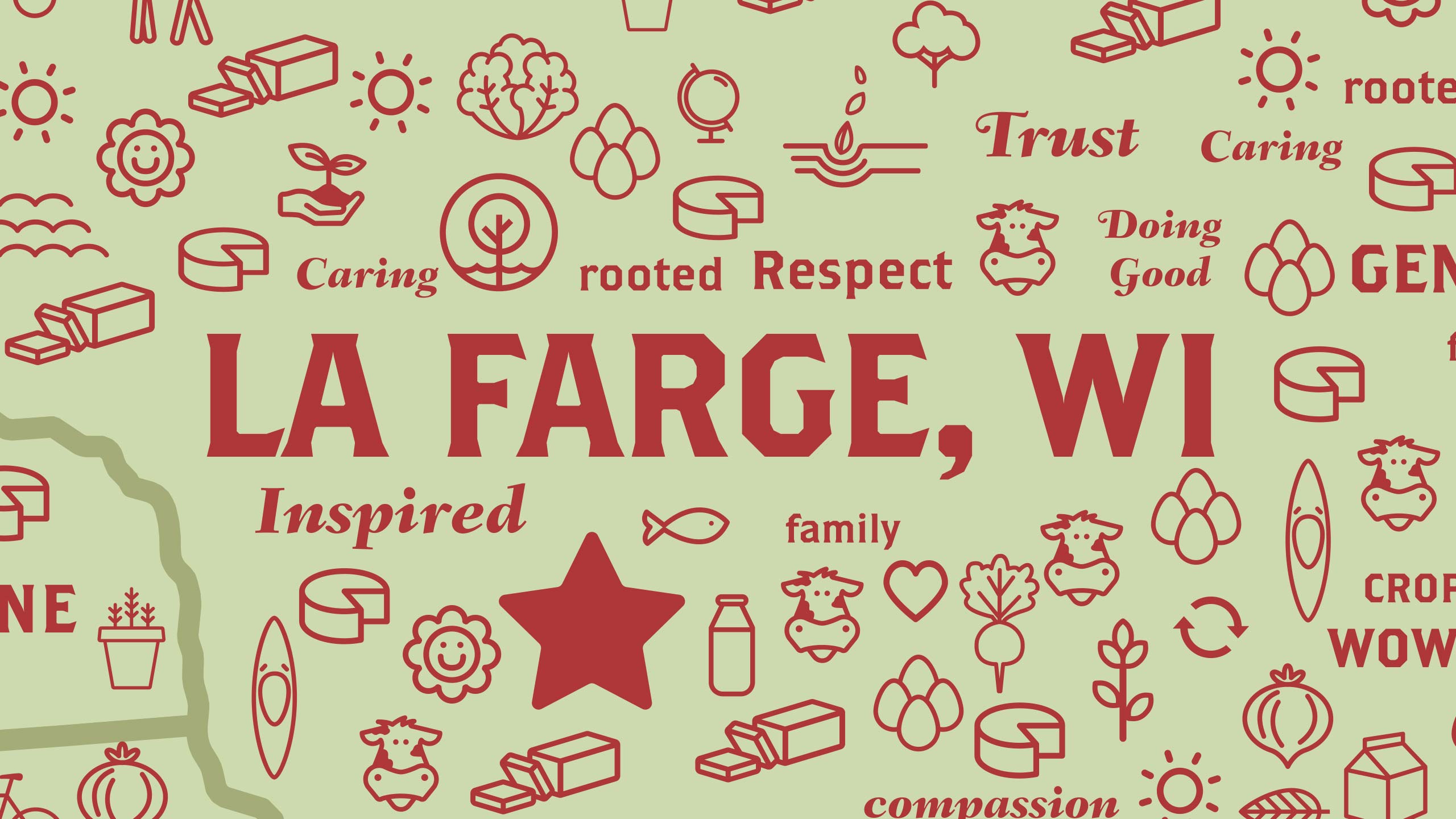
DESIGN / ILLUSTRATION / MOTIONFounded in 1988, Organic Valley is America’s largest farmer-owned organic cooperative and one of the world's largest organic consumer brands. They are a cooperative of farmers across the country who share the same commitment to growing food the right way. They aren’t driven by profits, they are driven by principles. These principles were graphically realized by earthy tones of sun, sky, grass, and soil. These graphics were used to produce an animated video about their Best Places to Work Award from Outside Magazine.


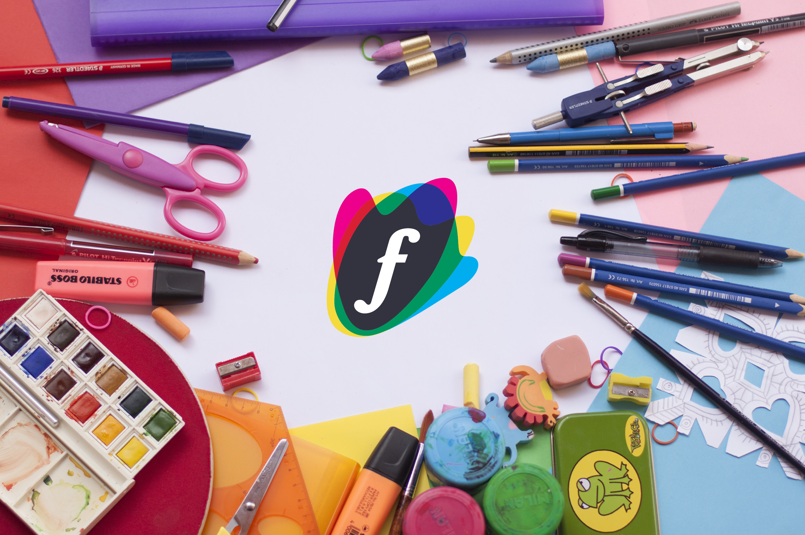
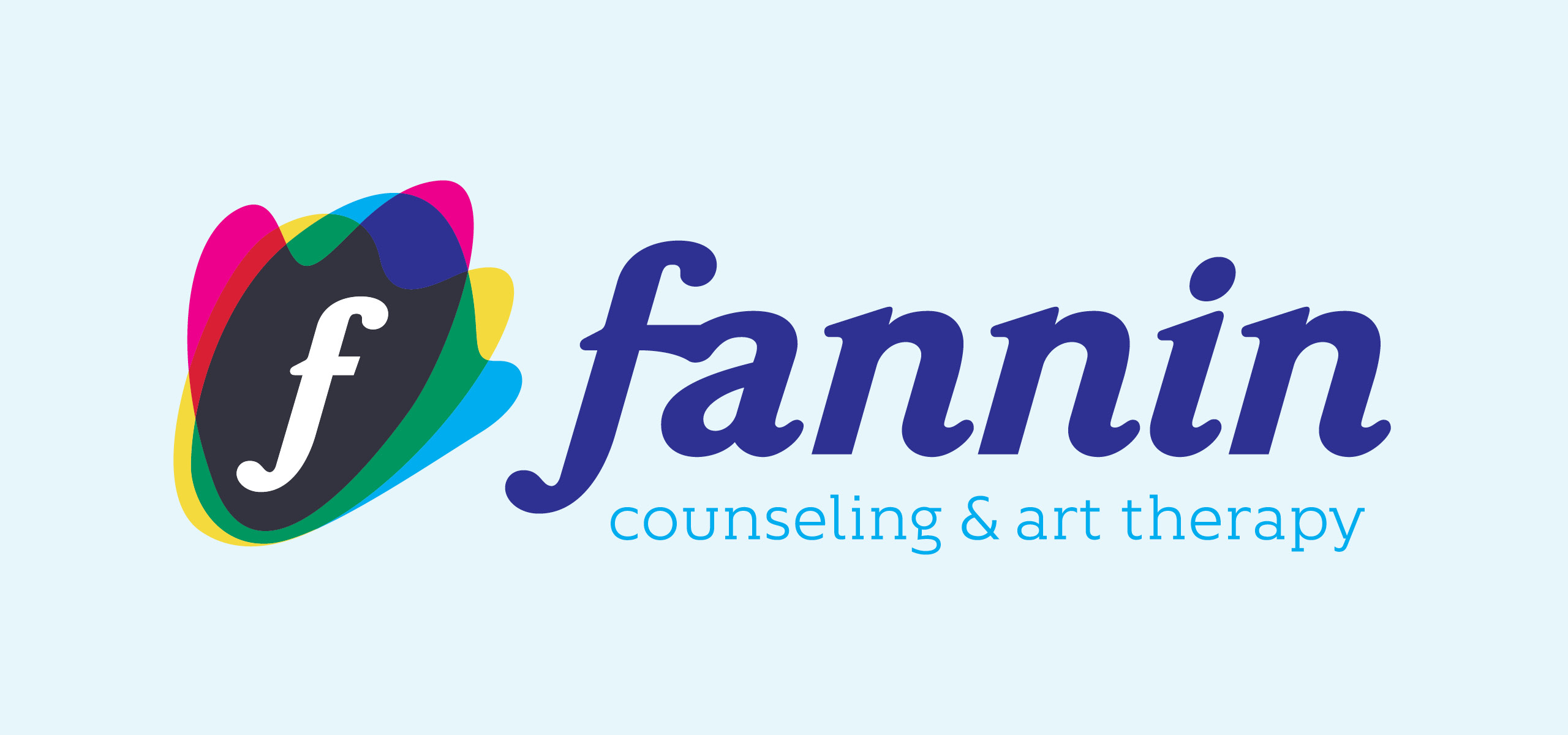
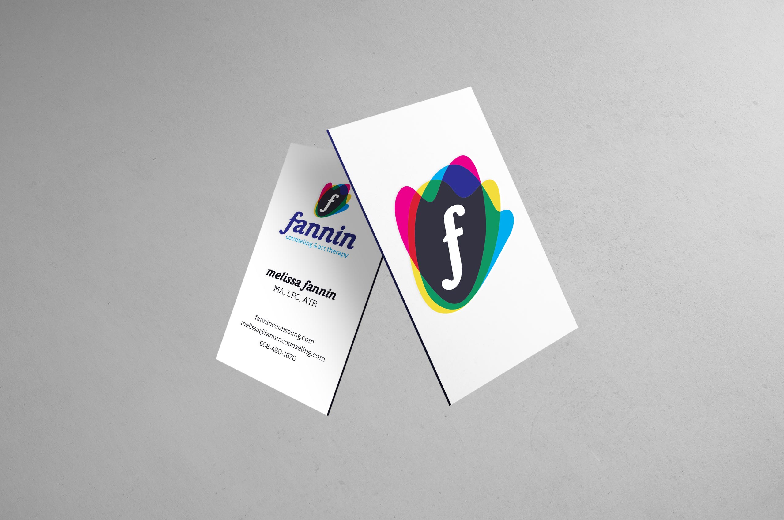
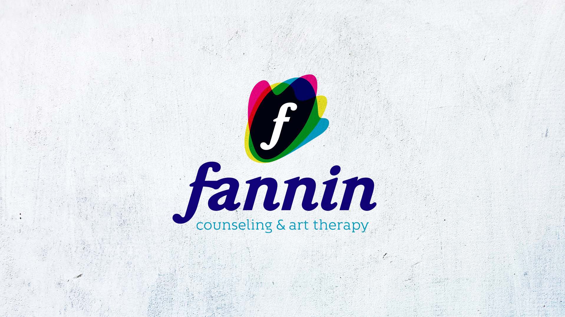
Fannin Counseling
& Art Therapy
BRANDING / DESIGN / MOTION Fannin needed a branding overhaul that conveyed its core traits, personality, and enthusiasm for helping others.
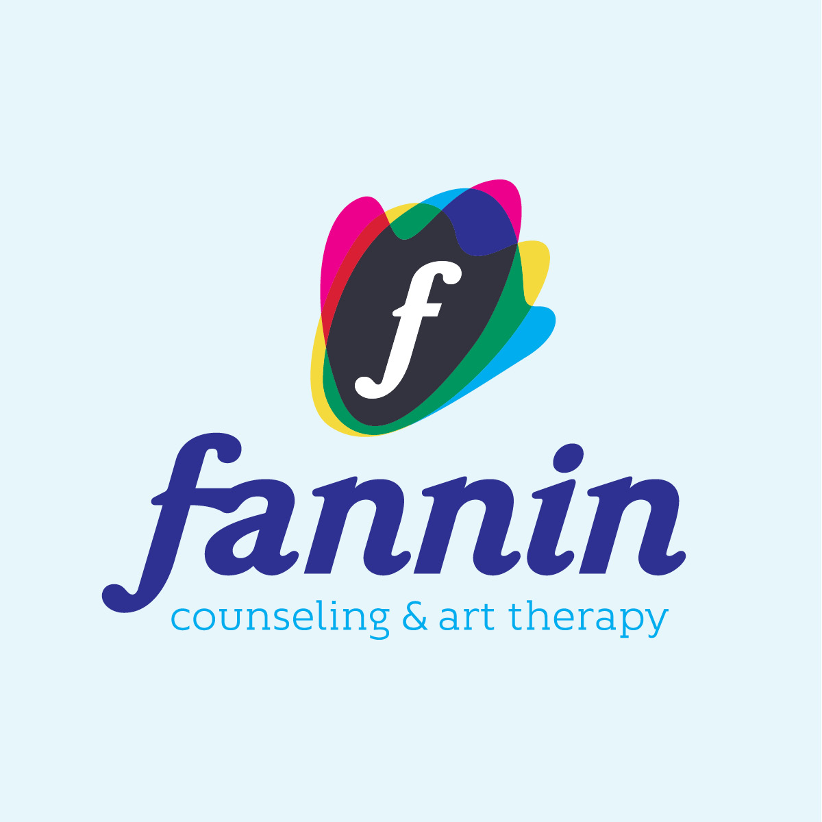
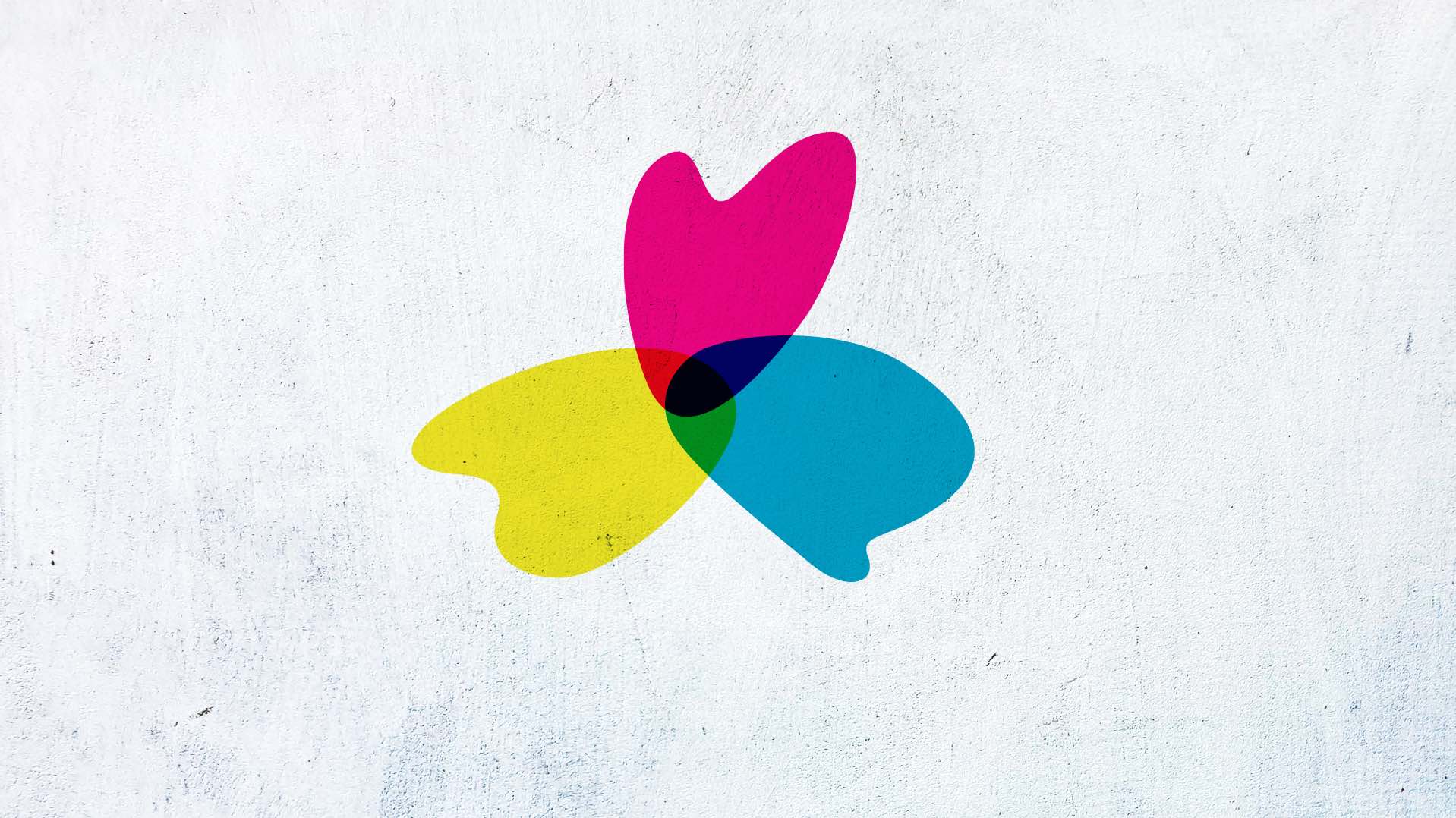
The icon and full logo needed to feel welcoming, friendly, and approachable. The bright colors, organic shapes, and rounded letters all help create this feeling. The letter f was also included in the icon so it could be recognized as a standalone mark.
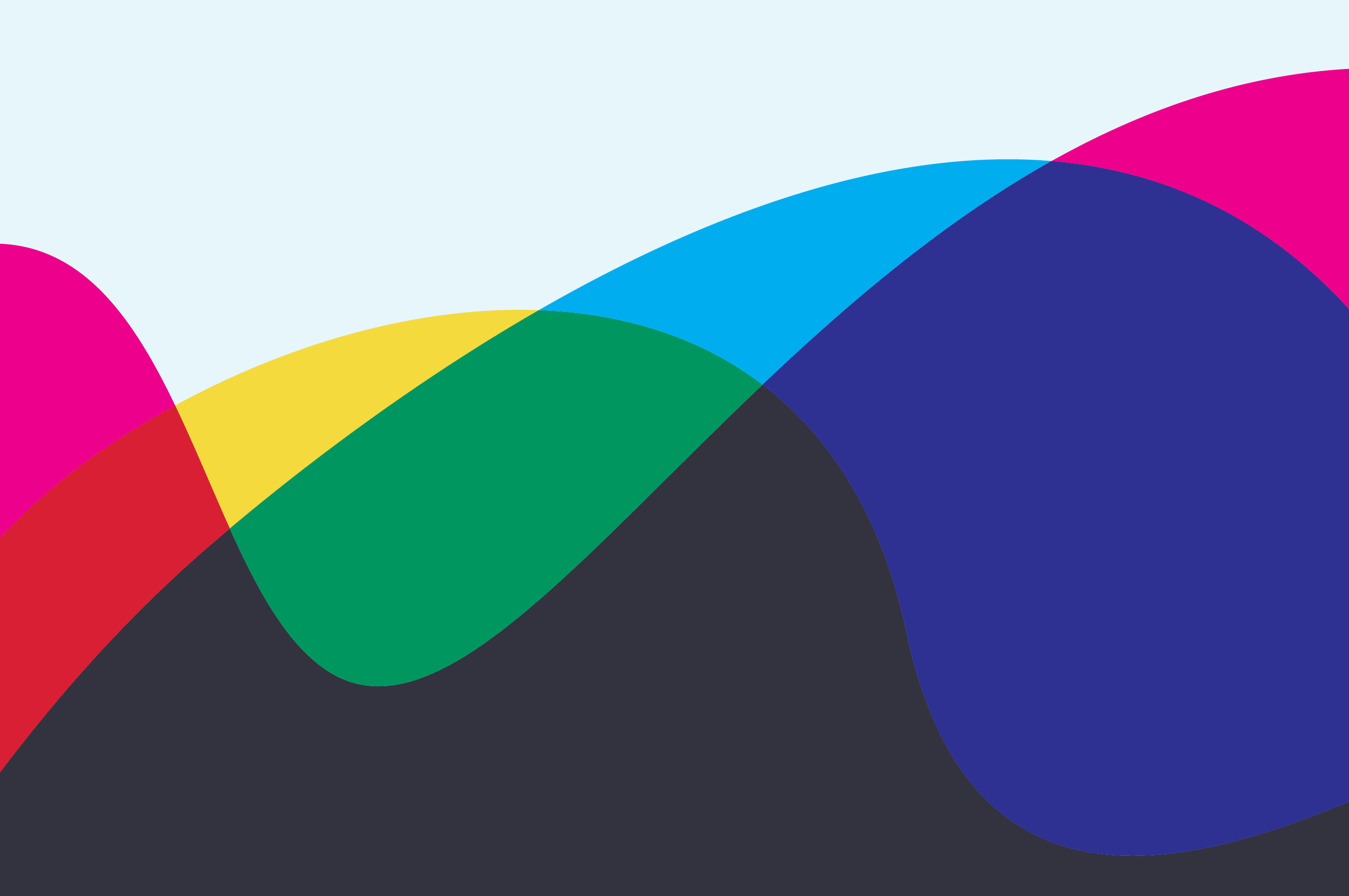
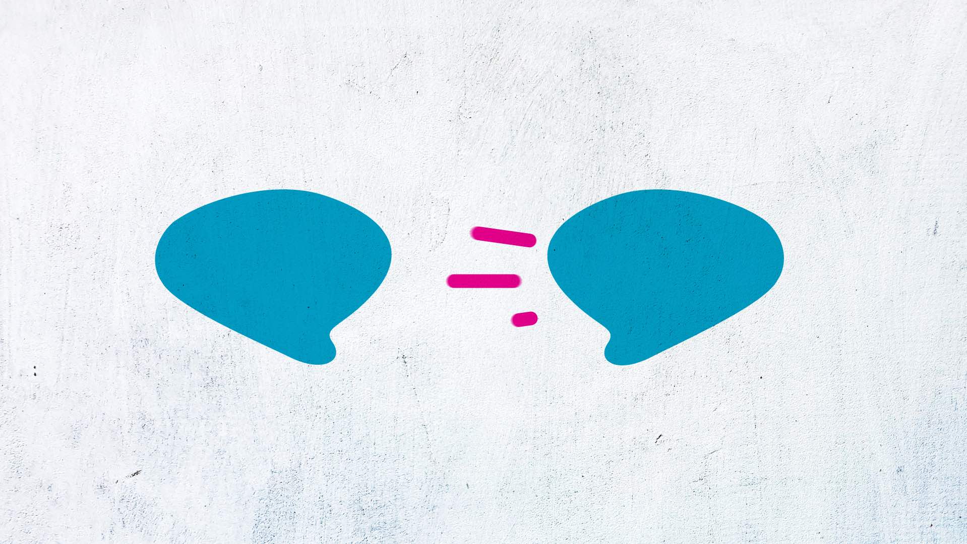
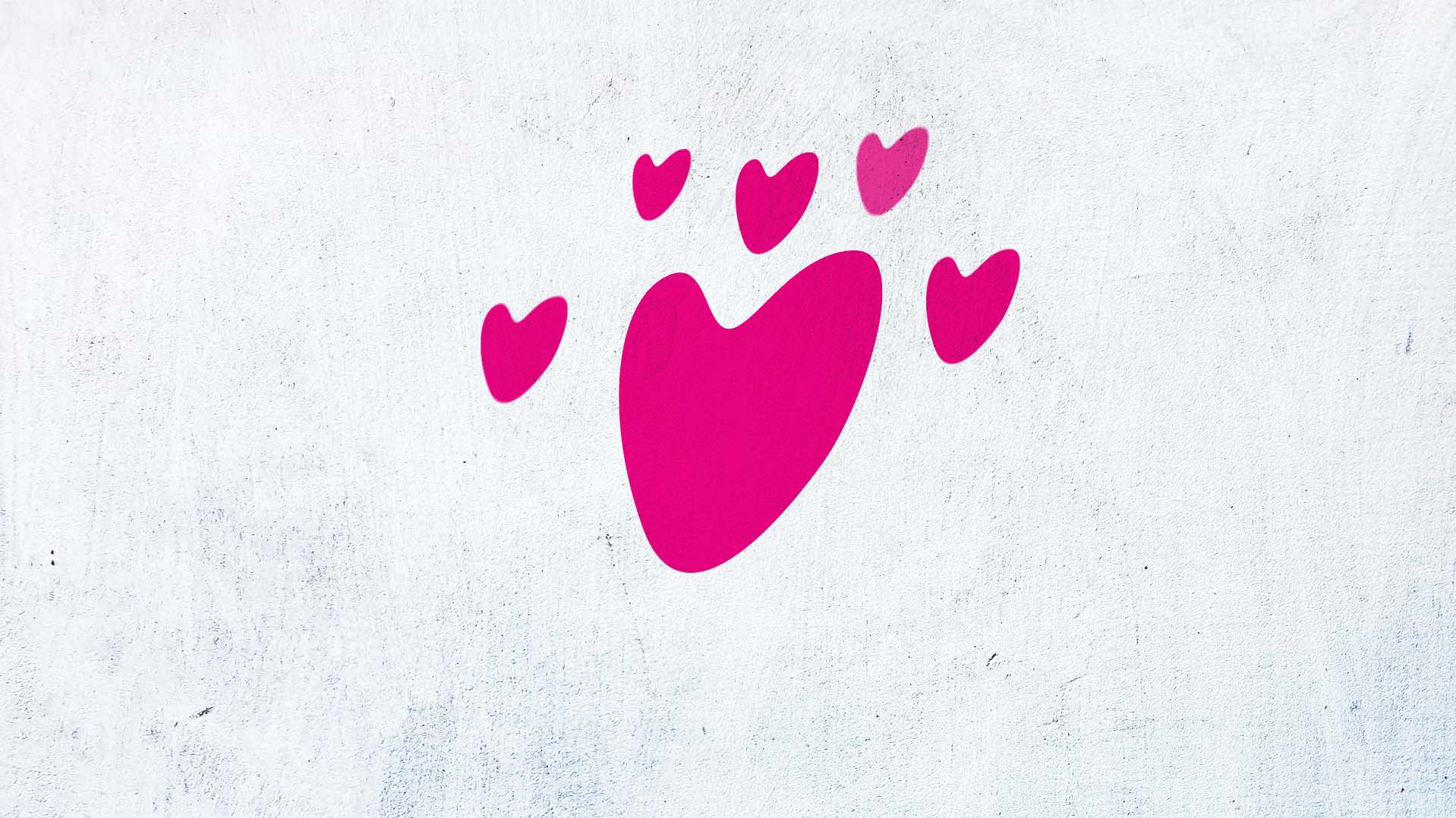
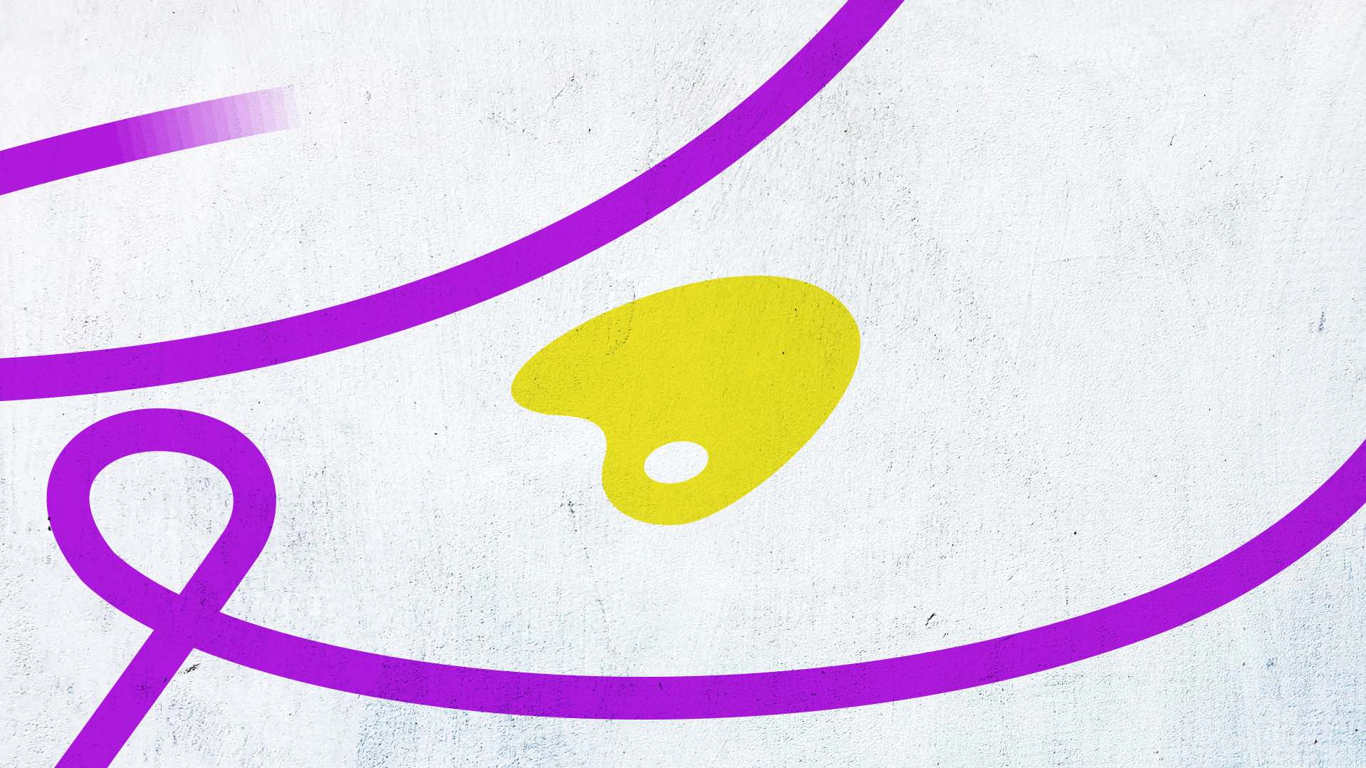
Bright, primary colors were chosen for their connection to art. They provide energy and are engaging. The overlapping shapes within the Fannin icon are three distinct shapes - heart, art palette, and speech bubble. These are at the core functioning of Fannin. Fannin connects with people, allowing them to share. People create to express themselves and their emotions. This allows them to safely and comfortably open up and communicate.


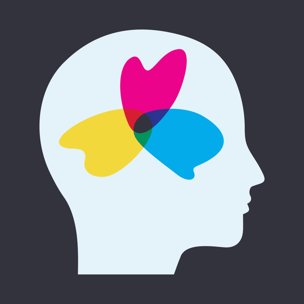

The shapes within the Fannin icon are also used as their own standalone mark, and within other graphics, such as the head silhouette.
The f in Fannin is representative of them reaching out and connecting with people they work with.
The f in Fannin is representative of them reaching out and connecting with people they work with.
With counseling sometimes having a stereotype around it, Fannin wanted people to draw their own conclusions upon entering their space. The pencil and pencil bag were a personal way to add some humor.

Their logo was animated, bringing life to the shapes within the logo.

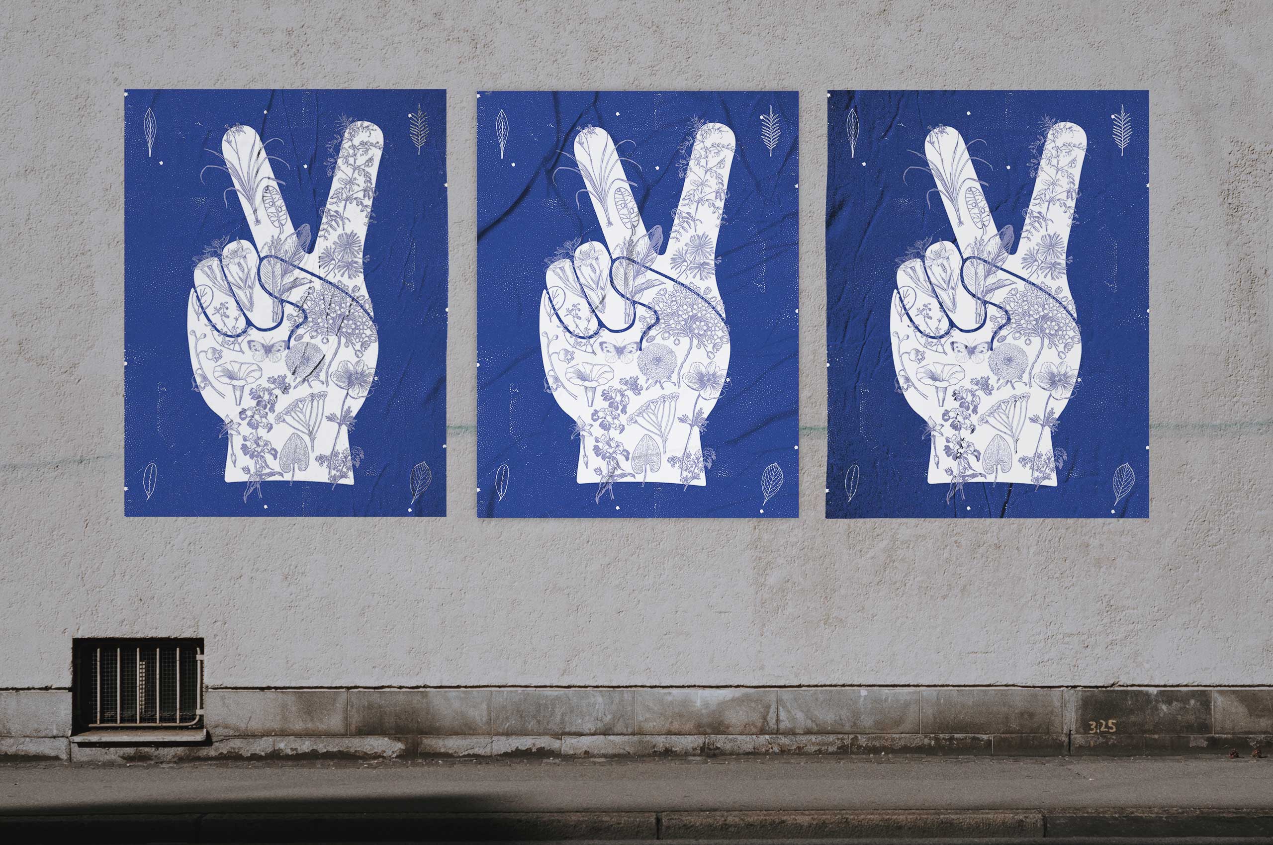
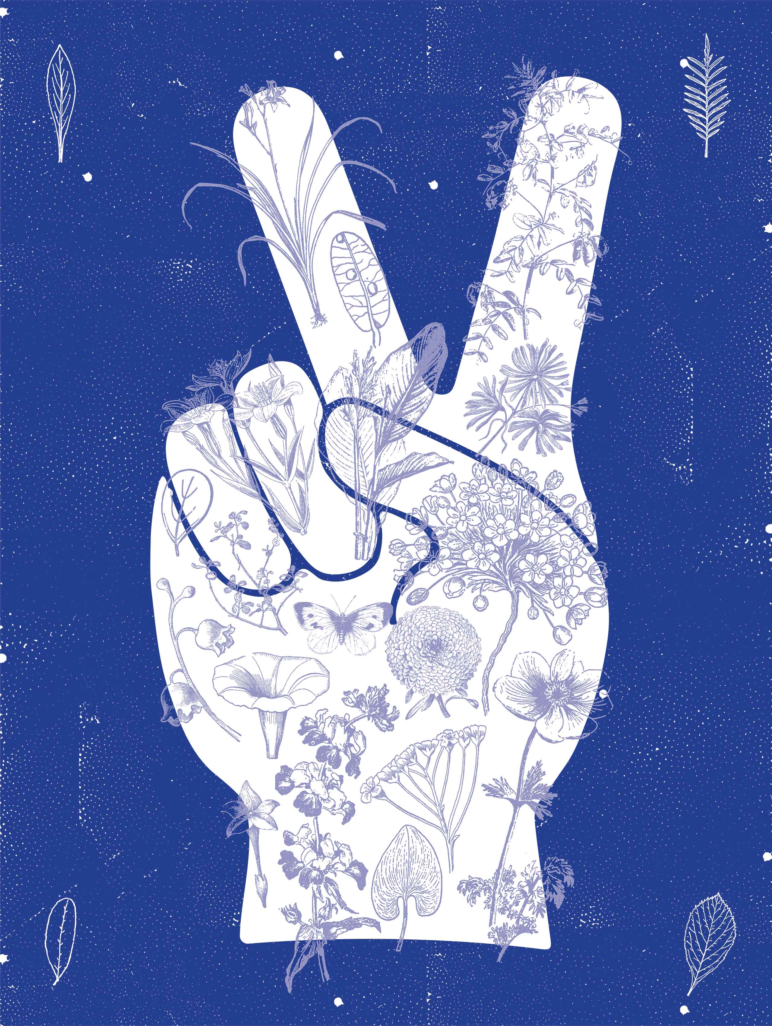
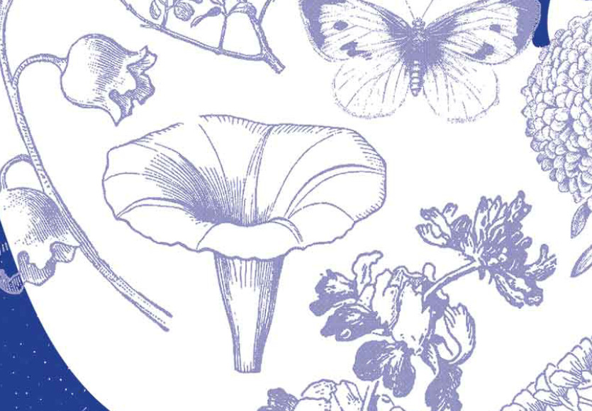
Peace
ILLUSTRATION / SCREENPRINTMix of a simple peace sign and a collage of detailed botanical drawings. Get your Zen on dude.
︎ 18”x 24” screenprint sold out.
︎ 18”x 24” screenprint sold out.


All content ©️ 2024 Cody Bartz